# Load packages
library(tidyverse)

# Define a function to generate a random vector of colors
generate_color_vector <- function(size, colors) {

  # Create a size^2 vector filled with a random sample of colors from a color list
  color_vector <- sample(x = colors,
                         size = size * size,   # "size" is the # of squares on each side
                         replace = TRUE)

  return(color_vector)
}

# Set the size of the desired grid and calculate number of circuits
size <- 40
circuits <- ifelse(size %% 2 == 0, size/2, (size+1)/2)

# Define the colors
colors <- c(#"#EDEFEE", # Paper
            "#1A8BB3", # Teal - no longer teal, just bright blue
            "#0950AE", # Dark blue
            "#4DACE5", # Light blue
            "#126DDB", # Blue
            "#E48DC4", # Pink
            "#ABA9E8", # Light purple
            "#872791", # Purple
            "#6D1617", # Dark red
            "#B81634", # Red
            "#DF3B43", # Red orange
            "#E35C47", # Orange
            "#EB8749", # Light orange
            "#F6E254", # Yellow
            "#7B442D", # Brown
            "#000000", # Black
            "#1A6E7E", # Dark green - no longer dark green, now looks teal
            "#7CBF7B", # Green
            "#ADD2B8") # Light green

# Generate the color grid
color_vector <- generate_color_vector(size, colors)

# Create a data frame for the grid coordinates
df <- expand.grid(x = 1:size, y = 1:size)

# Add the corresponding color to each grid cell coordinate
df$color <- color_vector

# Include my function that calculates probabilities based on circuits
# Maybe I should make it based on size? I will already have circuits, though.
get_prob_vector <- function(circuits){

  first10perc <- seq(0, 0.02857143, length.out = round(circuits*.10)+1) # 3

  last90perc_length <- circuits - length(first10perc)

  last10perc_length <- round(last90perc_length * (1/9)) # 2

  middle80perc_length <- last90perc_length - last10perc_length # 15

  middle80perc <- seq(0.02857143, 1, length.out = middle80perc_length+2)[-c(1, middle80perc_length+2)]

  last10perc <- rep(1, last10perc_length)

  prob_vector <- c(first10perc, middle80perc, last10perc)

  return(prob_vector)
}

prob_vector <- get_prob_vector(circuits)

# Create function that builds the prob matrix
get_prob_matrix <- function(size, prob_vector){

  # Calculate quad size same way as circuits
  quad_size <- ifelse(size %% 2 == 0, size/2, (size+1)/2)

  # Create empty matrix for the quad
  M <- matrix(0, nrow = quad_size, ncol = quad_size)

  # For loop to assign prob_vector to correct cells in quadrant
  for (i in 1:quad_size){

    M[i, i:quad_size] <- prob_vector[i]
    M[i:quad_size, i] <- prob_vector[i]
  }

  # if size is even,
  if(size %% 2 == 0){
    # mirror horizontally and column bind
    M_right <- apply(M, 1, rev)
    M <- cbind(M, M_right)

    # then mirror vertically and row bind
    M_down <- apply(M, 2, rev)
    M <- rbind(M, M_down)

  }else{ # if size is odd
    # mirror all but last col horizontally and col bind
    M_right <- apply(M[ , 1:(quad_size-1)], 1, rev)
    M <- cbind(M, M_right)

    # then mirror all but last row vertically and row bind
    M_down <- apply(M[1:(quad_size-1), ], 2, rev)
    M <- rbind(M, M_down)

  }

  return(M)
}

M <- get_prob_matrix(size, prob_vector)


# Apply M to df as a vector
df$probs <- as.vector(M)

# Can I verify I did this correctly by plotting a rounded version of each
# prob inside a tile? I asked ChatGPT to do this quickly and it came through

ggplot(df, aes(x = x, y = y, label = round(probs, 2))) +
  geom_tile(aes(fill = probs), colour = "white") +
  geom_text() +
  scale_fill_gradient(low = "white", high = "blue") +
  theme_minimal() +
  theme(axis.text = element_blank(),
        axis.title = element_blank(),
        panel.grid = element_blank(),
        plot.margin = margin(1, 1, 1, 1, "cm")) +
coord_fixed()The Ellsworth Project: Part 3
R
Shiny
Documenting the creation of The Ellsworth App, in which I assign probabilities to a matrix and reswatch colors.
February 22nd, 2024
I looked at my work from a few days before and realized I had been coding in a fugue state for the most part, and that my process documentation was abysmal. I normally document every step of development, but I had just gotten too turnt. I decided to not code for the day, and to instead spend it creating the documentation I shared in the first two blog posts. From this point on, I am going to document as I go. I also spent a lot of today trying to save my laptop which had been gasping its last breaths for the last 6 months. I updated my graphics drivers and defragged. Prayed. Lit a candle. Fingers crossed that my machine doesn’t die again tomorrow 🤞
Notes from now on will be written in the present tense, but are being copied over from raw work notes from last year. This means Future Libby is here with future knowledge, cringing at Past Libby and having a laugh.
February 23rd, 2024
🥳 Hey, my laptop didn’t crash this morning! That’s cause for celebration. I wrote some hand-written notes on how I’d like to tackle actually utilizing my probabilities. Do I want to use a sample() function and assign a vector of weights to the prob = option? I’d need to assign equal probability to all colors and then a (1-prob) probability for white (or whatever the background color is).
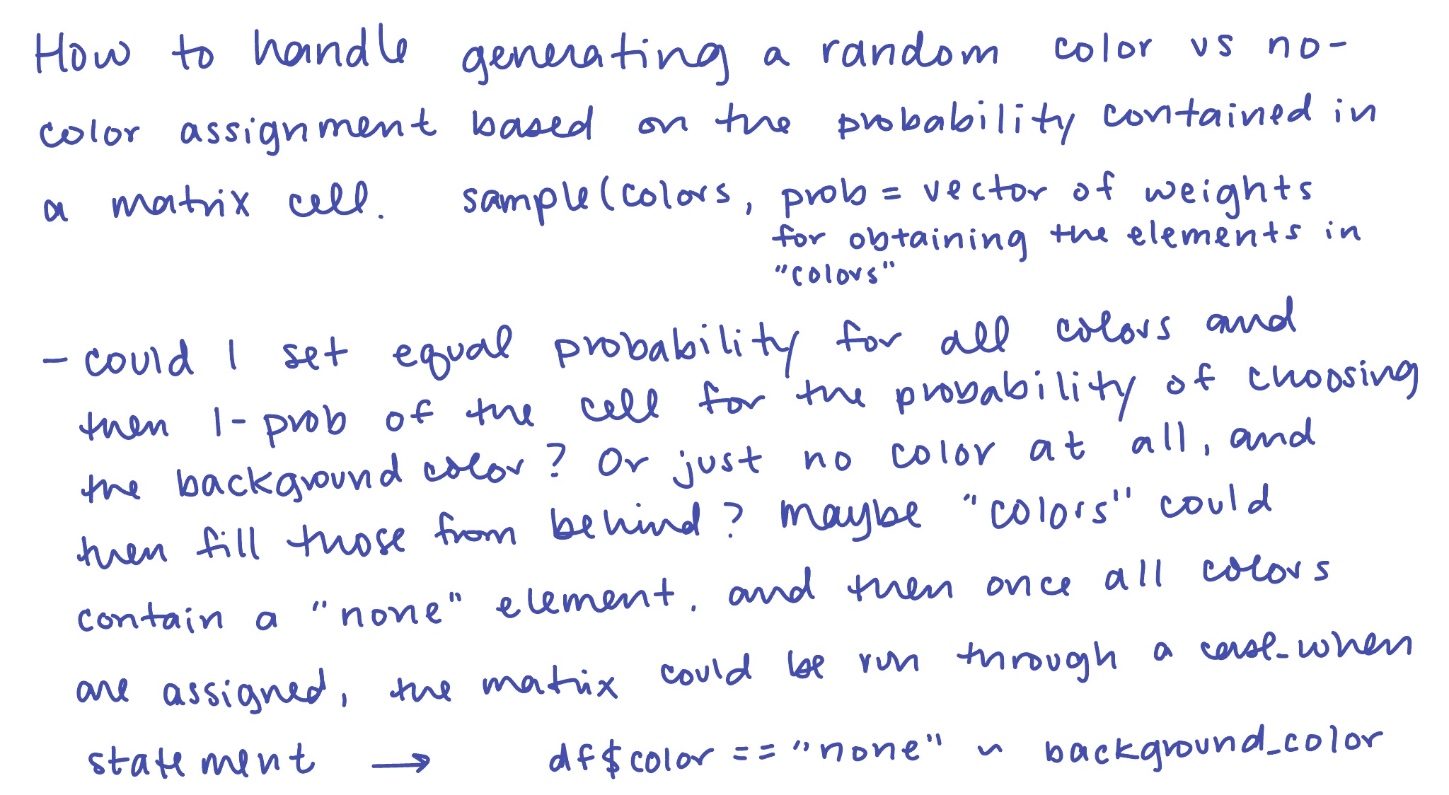
That’s a lot of coding, and it makes it WAY harder to parameterize the colors, allowing the user to potentially choose their own colors. But, my initial idea for how to assign the colors vs the background color was actually to just start with my “piece VII” plot of all those random colors (minus the white and black) and then just fill in the white/background tiles.
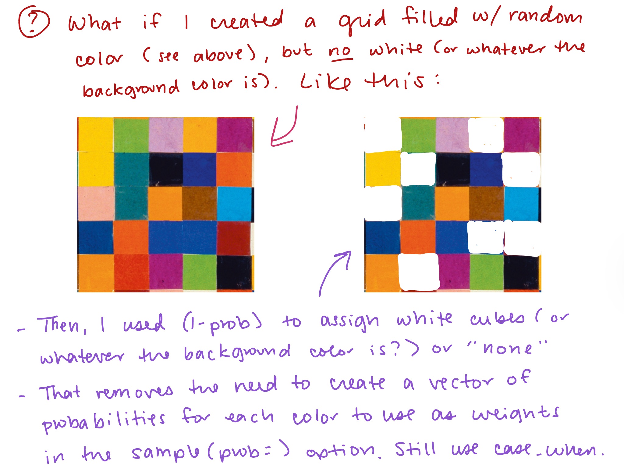
So, I’ll try that first to see if it works out alright. I don’t think I really need to start with the full plot from my proof of concept (piece VII), I think I just need the data frame that contained my grid coordinates and my colors. I will create a script that recreates the randomly assigned color vector, but without the color white.
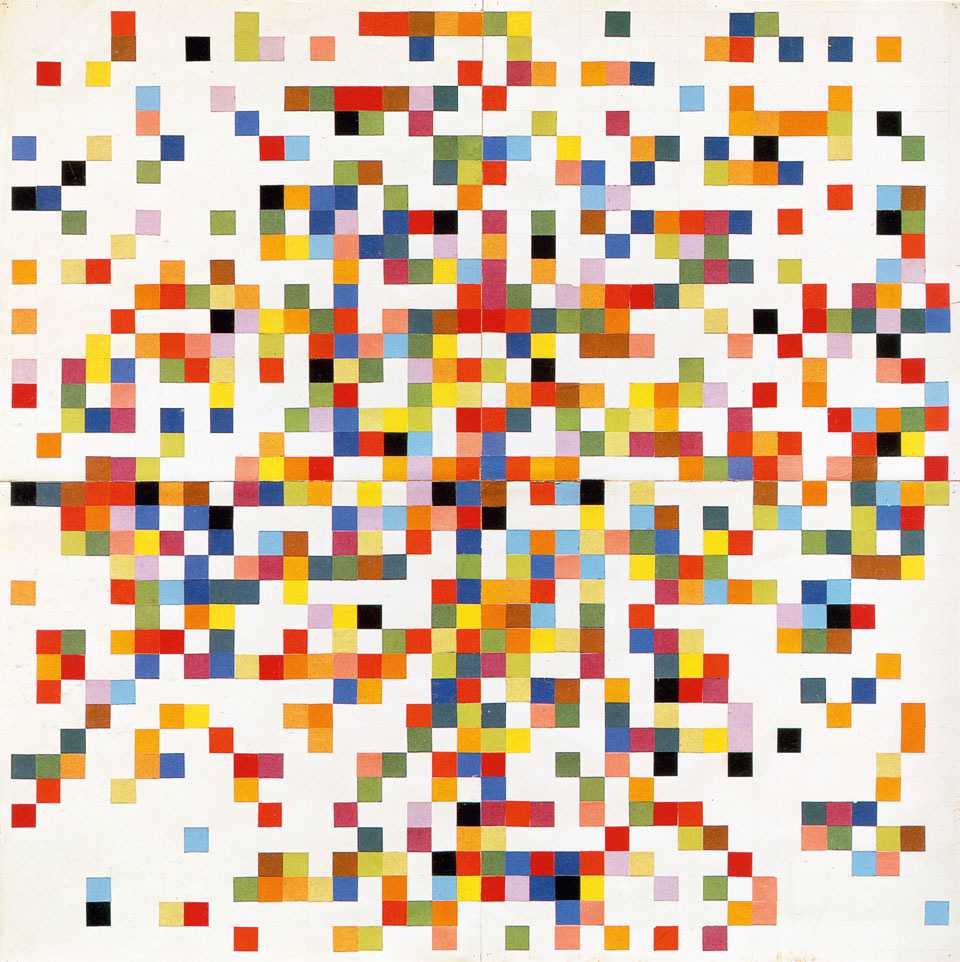
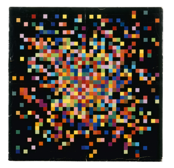
As far as I can tell, Kelly’s piece IV, which has a black background with a similarly clustered center of color, doesn’t feature any white as a color, but piece III, which has a white background, features black as a color. Not sure how I’ll tackle this yet if I choose to offer black as a background. Here’s Ellsworth’s original Piece IV with the black background, for reference.
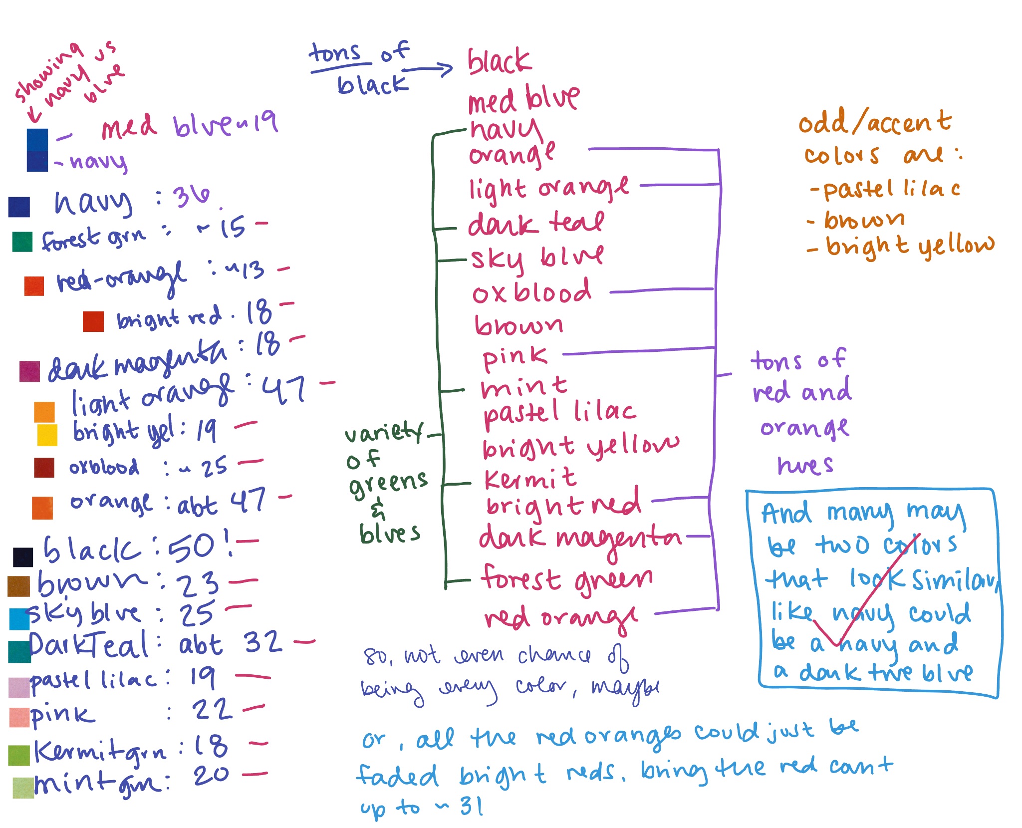
BUT FIRST! Since I’m at the point where I’m actually writing some pieces of final code, I’d like to sample the colors from piece III again, compare them to samples from other pieces, and try to identify all unique colors. I knew when I sampled the first time that there were nuances I wasn’t picking up, but they became more apparent to me as I was carefully counting all of the colors to measure probabilities.
From what I’ve read of Kelly’s process, he used little pieces of paper with his colors written on them, drawing them from a bowl randomly. He used about 40 squares of each color and he used something like 18 unique colors (plus black and white?), perhaps based on the colors of colored paper available to him at the time in France. I decided to get more clear on the proportions of each color, especially because it seemed like there were a LOT more red/orange squares than anything else. I was in for a surprise! The most prevalent color in piece III was actually black, followed by light orange and orange, assuming I counted correctly. And, hey, I did end up with 18 colors including black (not including the white of the page which I’ve labeled “paper” in the hex codes).
Here is my original count of the colors:
For my re-swatching of the colors, I did as much research as I could to find lots of different photos and videos of Kelly’s pieces. It seems likely his pieces have yellowed and faded over time, and the colors don’t look as vibrant as they probably once did. I know firsthand how much some colors can dull when exposed to light.
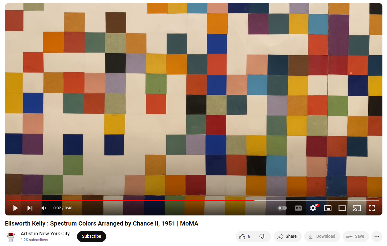
Take a look at a still from this video of piece II. The green and purple colors especially look dull in this lighting. I wonder if that’s how they feel in person. Piece II is paper pasted collage. Wish I could replicate the slight jitter that comes from some pieces being just slightly smaller or larger than others, but not sure it’s worth bothering about.
I decided to use the photograph of piece III that I have from the artist’s own website, but corrected the yellowing jussssst slightly and increased the saturation a tad to see if I could perhaps get a more true version of the colors, hopefully closer to what they originally might have looked like.
While there is something cozy and comforting about the warm, yellowed palette of the website photograph, what I’m keeping in mind is that Kelly’s art was all about full vibrancy, and that the title of the series includes the words “spectrum colors,” which denotes true colors of the visible spectrum of light (think ROYGBIV). I also consulted this image of piece II from the Tate’s page about Kelly’, which looks like it’s been brightened. I’m not sure I like the resulting colors I ended up with, but I’m forging ahead anyway. Colors on screens will never look the same to anyone and I’m planning to let folks use their own colors anyway!
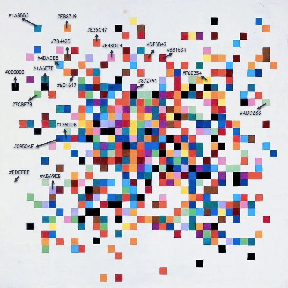
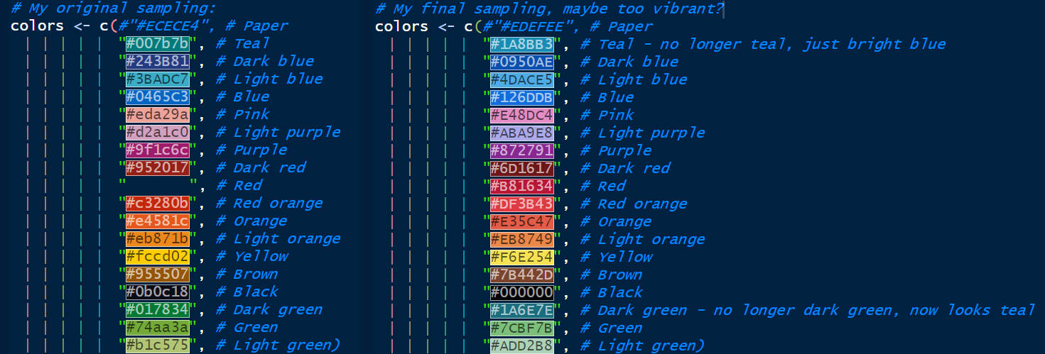
Here is my original sampling of colors on the left compared to my new sampling of colors on the right. In the coding environment I use (the RStudio IDE), hex values get filled in as their color on the screen, making it easy to see what you’re doing. Kinda cool for this comparison!
If you’re curious, I use a color picker Chrome Extension for sampling colors. Here’s the full palette in my favorite color visualization tool, Viz Palette:
The next step is to finally see if my handwritten code to assign probabilities to a matrix actually works. As a reminder, this was what I figured out:
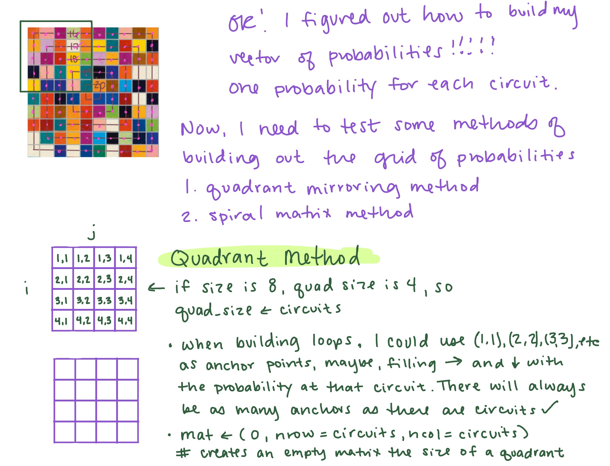
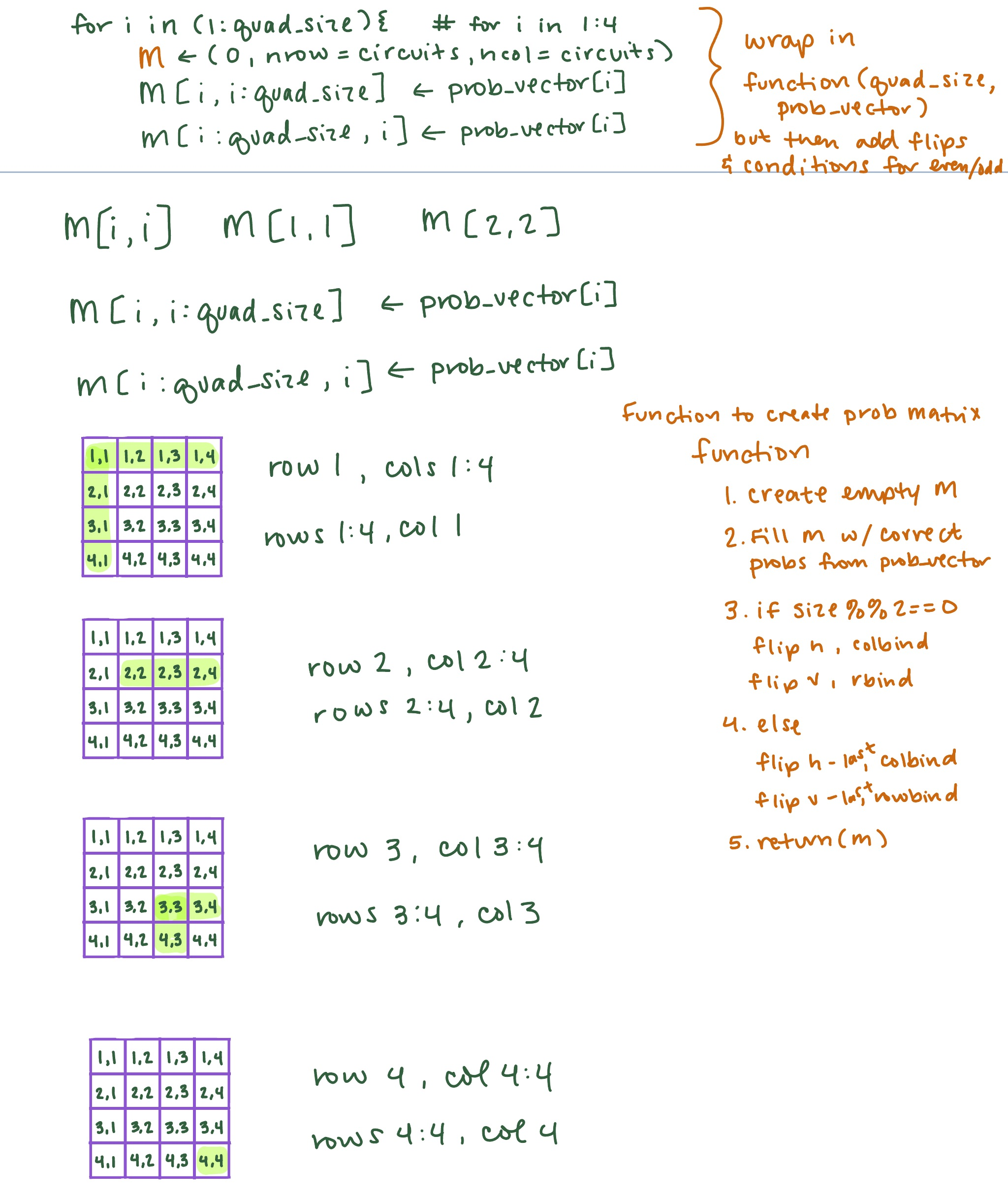
So, I’m building a matrix of probabilities based on the size of the desired grid, and I’ll then join that matrix up with my data frame of colors and coordinates. First, though, I need to build the quadrant I’ll use to mirror.
YIKES. That’s not right. All the blue (the 1 values) should be clustered in the center.
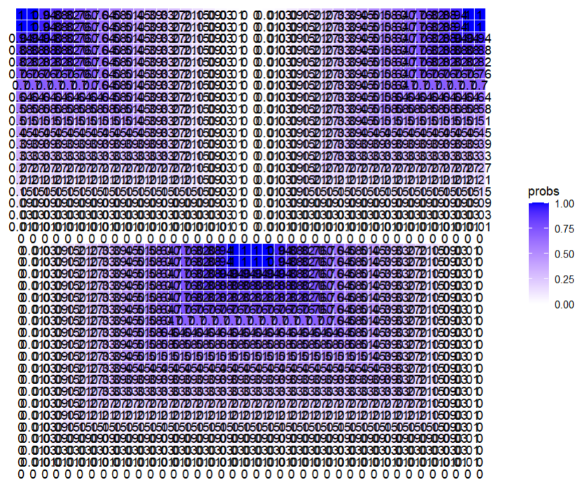
Something has definitely gone wrong somewhere, though.. the bottom part turned out correct, so that means multiple things might have gone wrong in just the right way. I’m going to start over and do things one by one, plotting each step of the way so that I can see what’s going on.
# Load packages
library(tidyverse)

# Define a function to generate a random vector of colors
generate_color_vector <- function(size, colors) {

  # Create a size^2 vector filled with a random sample of colors from a color list
  color_vector <- sample(x = colors,
                         size = size * size,   # "size" is the # of squares on each side
                         replace = TRUE)

  return(color_vector)
}

# Set the size of the desired grid and calculate number of circuits
size <- 40
circuits <- ifelse(size %% 2 == 0, size/2, (size+1)/2)

# Define the colors
colors <- c(#"#EDEFEE", # Paper
            "#1A8BB3", # Teal - no longer teal, just bright blue
            "#0950AE", # Dark blue
            "#4DACE5", # Light blue
            "#126DDB", # Blue
            "#E48DC4", # Pink
            "#ABA9E8", # Light purple
            "#872791", # Purple
            "#6D1617", # Dark red
            "#B81634", # Red
            "#DF3B43", # Red orange
            "#E35C47", # Orange
            "#EB8749", # Light orange
            "#F6E254", # Yellow
            "#7B442D", # Brown
            "#000000", # Black
            "#1A6E7E", # Dark green - no longer dark green, now looks teal
            "#7CBF7B", # Green
            "#ADD2B8") # Light green

# Generate the color grid
color_vector <- generate_color_vector(size, colors)

# Create a data frame for the grid coordinates
df <- expand.grid(x = 1:size, y = 1:size)

# Add the corresponding color to each grid cell coordinate
df$color <- color_vector

# Include my function that calculates probabilities based on circuits
# Maybe I should make it based on size? I will already have circuits, though.
get_prob_vector <- function(circuits){

  first10perc <- seq(0, 0.02857143, length.out = round(circuits*.10)+1) # 3

  last90perc_length <- circuits - length(first10perc)

  last10perc_length <- round(last90perc_length * (1/9)) # 2

  middle80perc_length <- last90perc_length - last10perc_length # 15

  middle80perc <- seq(0.02857143, 1, length.out = middle80perc_length+2)[-c(1, middle80perc_length+2)]

  last10perc <- rep(1, last10perc_length)

  prob_vector <- c(first10perc, middle80perc, last10perc)

  return(prob_vector)
}

prob_vector <- get_prob_vector(circuits)

# Create function that builds the prob matrix
Ok, this is where I’m going to start iterating to diagnose.
quad_size <- ifelse(size %% 2 == 0, size/2, (size+1)/2)

# Create empty matrix for the quad
M <- matrix(0, nrow = quad_size, ncol = quad_size)

# Plot the empty matrix
grid_data <- expand.grid(row = 1:20, col = 1:20)
grid_data$probs <- as.vector(M)

ggplot(grid_data, aes(x = col, y = row, label = round(probs, 2))) +
  geom_tile(aes(fill = probs), colour = "white") +
  geom_text() +
  scale_fill_gradient(low = "white", high = "blue") +
  theme_minimal() +
  theme(axis.text = element_blank(),
        axis.title = element_blank(),
        panel.grid = element_blank(),
        plot.margin = margin(1, 1, 1, 1, "cm")) +
  coord_fixed()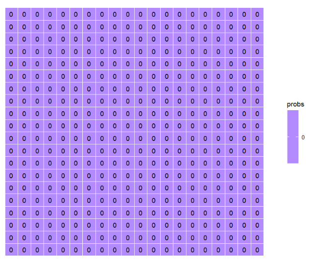
Looks good. Next step, create the initial quadrant. Going to switch to using reshape2::melt() for reshaping my matrix M into a vector. I just like it better than as.vector.
# For loop to assign prob_vector to correct cells in quadrant
for (i in 1:quad_size){

  M[i, i:quad_size] <- prob_vector[i]
  M[i:quad_size, i] <- prob_vector[i]
}

# Plot again

grid_data <- expand.grid(row = 1:20, col = 1:20)
> grid_data[1:30, ]
    row col
1     1   1
2     2   1
3     3   1
4     4   1
5     5   1
6     6   1
7     7   1
8     8   1
9     9   1
10   10   1
11   11   1
12   12   1
13   13   1
14   14   1
15   15   1
16   16   1
17   17   1
18   18   1
19   19   1
20   20   1
21    1   2
22    2   2
23    3   2
24    4   2
25    5   2
26    6   2
27    7   2
28    8   2
29    9   2
30   10   2
# This looks right

probs_df <- reshape2::melt(M)
> probs_df[1:25, ]
    Var1 Var2      value
1      1    1 0.00000000
2      2    1 0.00000000
3      3    1 0.00000000
4      4    1 0.00000000
5      5    1 0.00000000
6      6    1 0.00000000
7      7    1 0.00000000
8      8    1 0.00000000
9      9    1 0.00000000
10    10    1 0.00000000
11    11    1 0.00000000
12    12    1 0.00000000
13    13    1 0.00000000
14    14    1 0.00000000
15    15    1 0.00000000
16    16    1 0.00000000
17    17    1 0.00000000
18    18    1 0.00000000
19    19    1 0.00000000
20    20    1 0.00000000
21     1    2 0.00000000
22     2    2 0.01428571
23     3    2 0.01428571
24     4    2 0.01428571
25     5    2 0.01428571
# This looks right

grid_data$probs <- reshape2::melt(M)[, 3]
> grid_data[1:30, ]
   row col      probs
1    1   1 0.00000000
2    2   1 0.00000000
3    3   1 0.00000000
4    4   1 0.00000000
5    5   1 0.00000000
6    6   1 0.00000000
7    7   1 0.00000000
8    8   1 0.00000000
9    9   1 0.00000000
10  10   1 0.00000000
11  11   1 0.00000000
12  12   1 0.00000000
13  13   1 0.00000000
14  14   1 0.00000000
15  15   1 0.00000000
16  16   1 0.00000000
17  17   1 0.00000000
18  18   1 0.00000000
19  19   1 0.00000000
20  20   1 0.00000000
21   1   2 0.00000000
22   2   2 0.01428571
23   3   2 0.01428571
24   4   2 0.01428571
25   5   2 0.01428571
26   6   2 0.01428571
27   7   2 0.01428571
28   8   2 0.01428571
29   9   2 0.01428571
30  10   2 0.01428571
# This looks right

ggplot(grid_data, aes(x = col, y = row, label = round(probs, 2))) +
  geom_tile(aes(fill = probs), colour = "white") +
  geom_text() +
  scale_fill_gradient(low = "white", high = "blue") +
  theme_minimal() +
  theme(axis.text = element_blank(),
        axis.title = element_blank(),
        panel.grid = element_blank(),
        plot.margin = margin(1, 1, 1, 1, "cm")) +
  coord_fixed()
# But this is wrong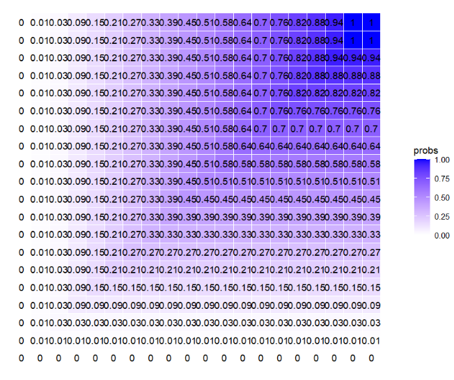
Alright, this is definitely not correct, but why? I’ve definitely got something wrong. I’m going to inspect my for loop used to assign probabilities to the quad matrix.
for (i in 1:quad_size){

  M[i, i:quad_size] <- prob_vector[i] # row 1, columns 1:20
  M[i:quad_size, i] <- prob_vector[i] # col 1, rows 1:20
}

# So, M[1,1] should be 0 and M[20,20] should be 1
# > M[1,1]
# [1] 0
# > M[20,20]
# [1] 1

# And they are

# Column 20 should be probs from 0 to 1
# > M[, 20]
#  [1] 0.00000000 0.01428571 0.02857143
#  [4] 0.08928572 0.15000000 0.21071429
#  [7] 0.27142857 0.33214286 0.39285714
# [10] 0.45357143 0.51428571 0.57500000
# [13] 0.63571429 0.69642857 0.75714286
# [16] 0.81785714 0.87857143 0.93928571
# [19] 1.00000000 1.00000000

# And it is
I’m going to do a minimally viable example creating a simple matrix, melting it, and then plotting it using geom_tile to see what it looks like.
m <- matrix(1:25, nrow = 5, ncol = 5)
m
#      [,1] [,2] [,3] [,4] [,5]
# [1,]    1    6   11   16   21
# [2,]    2    7   12   17   22
# [3,]    3    8   13   18   23
# [4,]    4    9   14   19   24
# [5,]    5   10   15   20   25

grid_data_test <- expand.grid(row = 1:5, col = 1:5)

grid_data_test
#    row col
# 1    1   1
# 2    2   1
# 3    3   1
# 4    4   1
# 5    5   1
# 6    1   2
# 7    2   2
# 8    3   2
# 9    4   2
# 10   5   2
# 11   1   3
# 12   2   3
# 13   3   3
# 14   4   3
# 15   5   3
# 16   1   4
# 17   2   4
# 18   3   4
# 19   4   4
# 20   5   4
# 21   1   5
# 22   2   5
# 23   3   5
# 24   4   5
# 25   5   5

grid_data_test$probs <- reshape2::melt(m)[, 3]

grid_data_test
#    row col probs
# 1    1   1     1
# 2    2   1     2
# 3    3   1     3
# 4    4   1     4
# 5    5   1     5
# 6    1   2     6
# 7    2   2     7
# 8    3   2     8
# 9    4   2     9
# 10   5   2    10
# 11   1   3    11
# 12   2   3    12
# 13   3   3    13
# 14   4   3    14
# 15   5   3    15
# 16   1   4    16
# 17   2   4    17
# 18   3   4    18
# 19   4   4    19
# 20   5   4    20
# 21   1   5    21
# 22   2   5    22
# 23   3   5    23
# 24   4   5    24
# 25   5   5    25

# Plot
ggplot(grid_data_test, aes(x = col, y = row, label = round(probs, 2))) +
  # geom_tile(aes(fill = probs), colour = "white") +
  geom_text() +
  scale_fill_gradient(low = "white", high = "blue") +
  theme_minimal() +
  theme(axis.text = element_blank(),
        axis.title = element_blank(),
        panel.grid = element_blank(),
        plot.margin = margin(1, 1, 1, 1, "cm")) +
  coord_fixed()
OK WHAT THE HECK, GGPLOT. I thought I knew what was up. I thought my x and y were flipped and I was calling x the row and y the col (which I probably am still doing somewhere), but this is definitely happening somewhere within the ggplot code… probably… and I can’t figure it out. Don’t code tired, Libby, you’re missing something super simple.
[Note from Future Libby: Oh, goodness. This is hard to watch. THINK ABOUT HOW GGPLOT MAKES PLOTS.]
Hope you’ve enjoyed the chaos! I’ll link the fourth part in the series here, and here’s the app in its current form if you’d like to play with it!.